Templates
Find the design that fits your work
Every template adapts to the content you add, works on any screen and can be switched later without losing anything. Open a preview to see it filled with realistic sample content.
Templates
Every template adapts to the content you add, works on any screen and can be switched later without losing anything. Open a preview to see it filled with realistic sample content.
22 templates
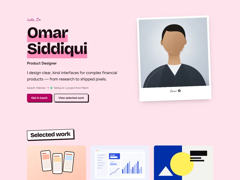
A scrapbook with personality: tilted sticker headings, a polaroid portrait and handwritten notes.
Creative portfolio
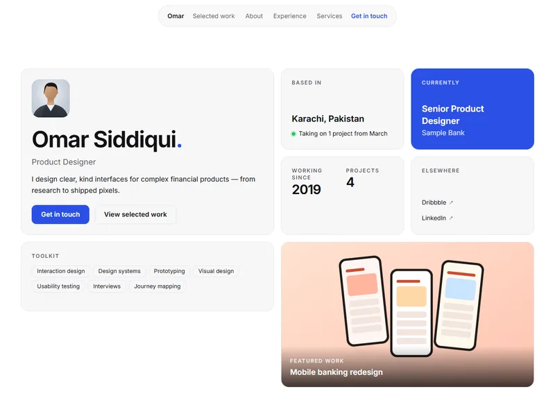
A crisp bento overview in snow white with Inter throughout — like a well-built design system.
Product & UX design
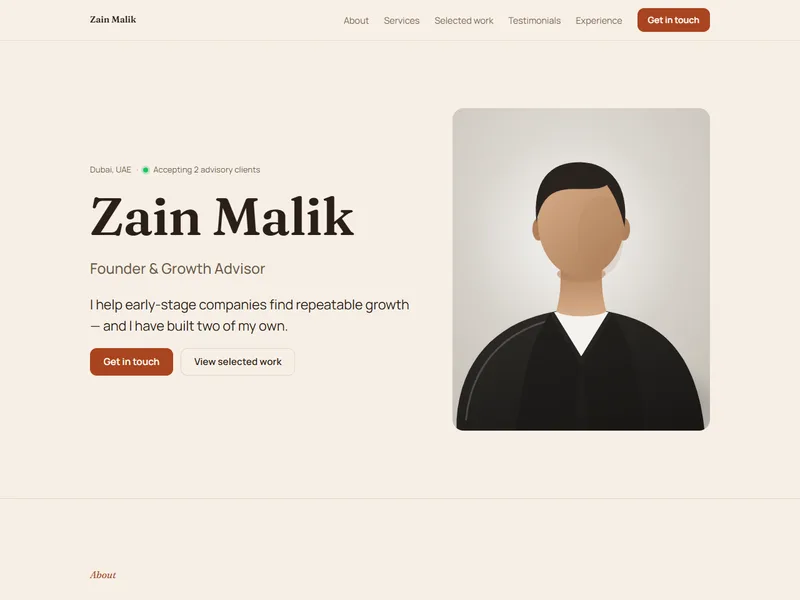
Built to win clients: portrait hero, clear services with pricing, proof and an easy way to get in touch.
Freelancing & consulting
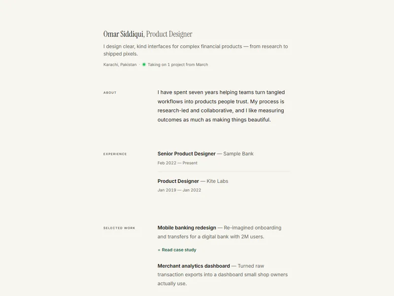
A single quiet column with labels in the margin. Lets well-written work speak without decoration.
Minimal & editorial
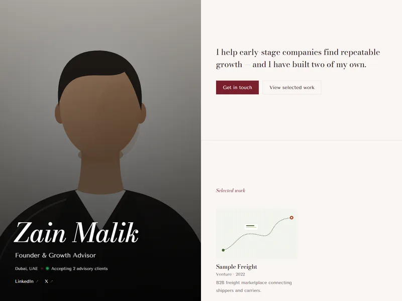
Fashion-house split screen: a full-height portrait in deep bordeaux opposite a calm narrative column.
Luxury professional
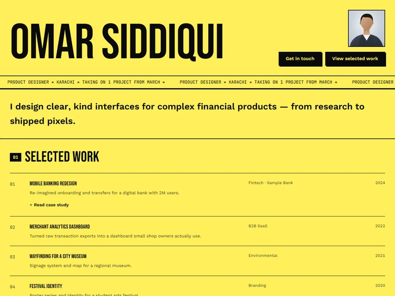
Raw and loud: signal yellow, condensed capitals, a scrolling ticker and boxed sections with thick rules.
Creative portfolio
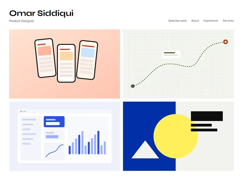
Your work covers the first screen as an image wall; your name and story sit quietly beside it.
Creative portfolio
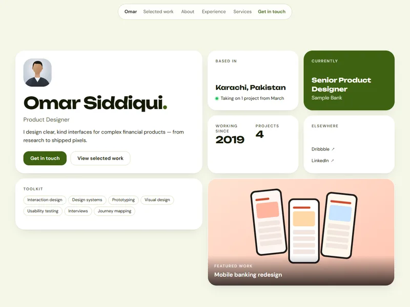
A friendly bento grid that summarizes you at a glance — built only from the facts you have entered.
Creative portfolio
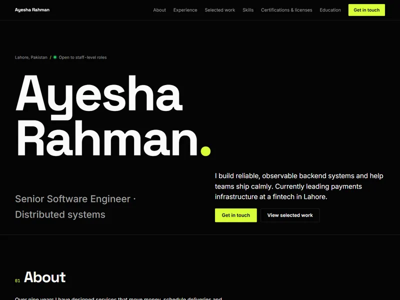
Electric lime on black with a huge type-only hero. Unmissable, fast, and pleasingly direct.
Modern technology
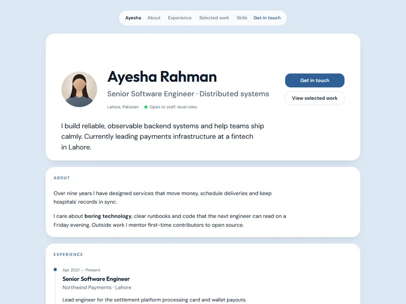
Every section as a rounded card on a soft canvas, with a light/dark switch that follows the visitor.
Modern technology
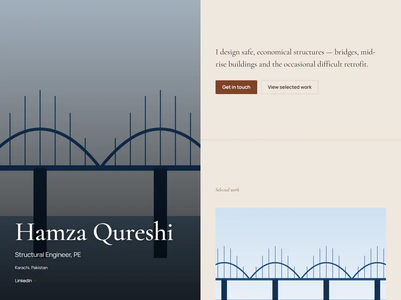
A full-height cover image holds one half of the screen while your practice unfolds on the other.
Architecture & interior design
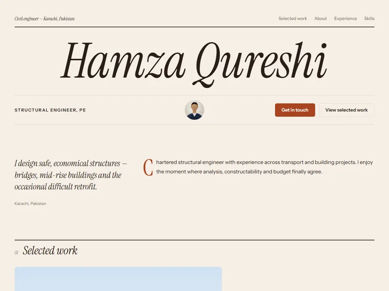
Terracotta warmth and editorial composition — tactile, considered, a little poetic.
Architecture & interior design
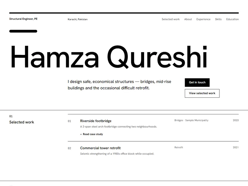
Pure black and white on a strict 12-column grid. Rational, quiet, architectural.
Architecture & interior design
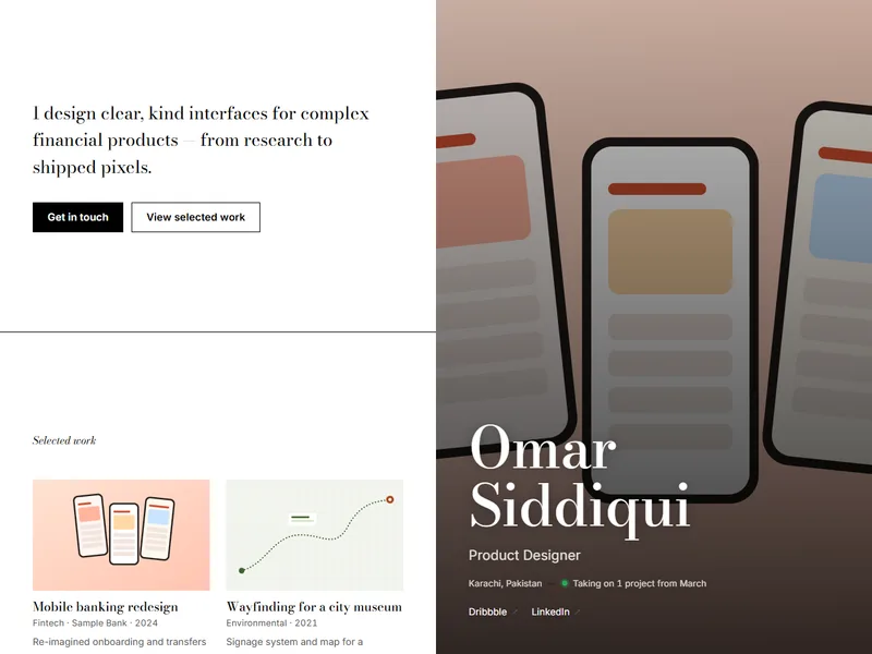
Gallery-wall split screen: one striking image, a fashion-serif name and a curated narrative.
Photography & visual arts
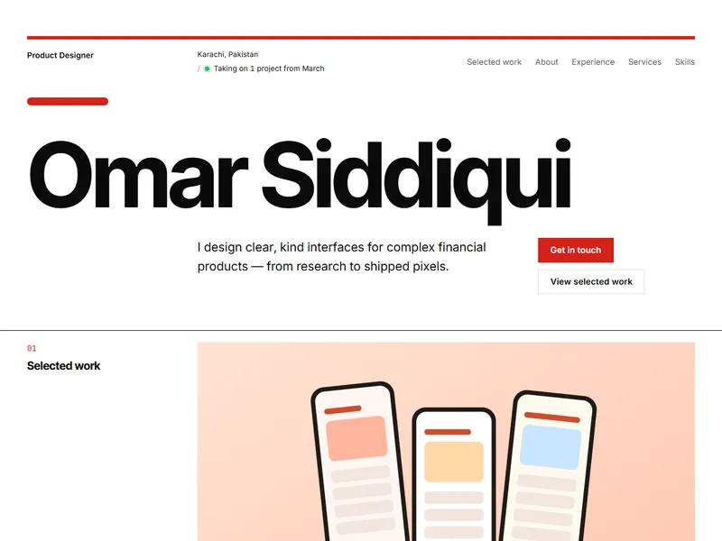
Swiss red on white, a strict grid and numbered sections — like the brand guidelines you'd write.
Marketing & communications
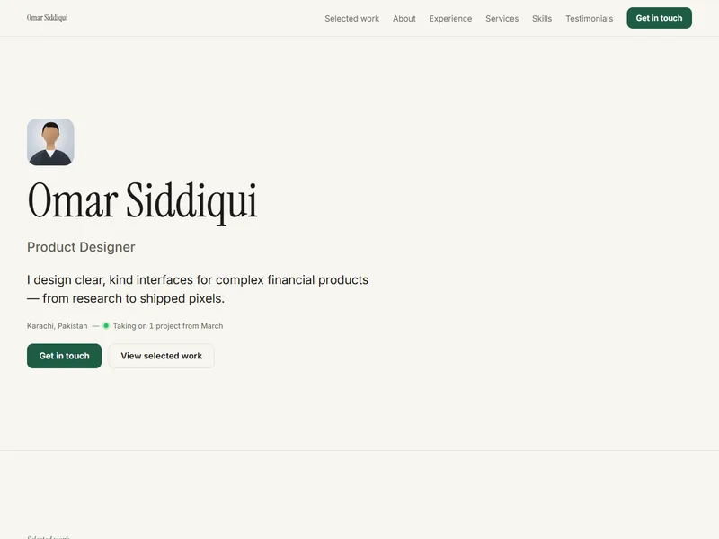
Built around long-form case studies: problem, approach and measured outcomes, alternating with visuals.
Product & UX design
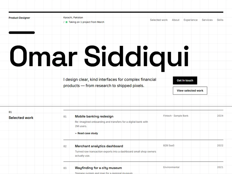
Monochrome Swiss grid on a faint pixel lattice. Systematic, rational and quietly playful.
Product & UX design
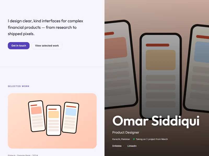
Lavender split screen with your portrait on the right and a smooth, readable product story.
Product & UX design
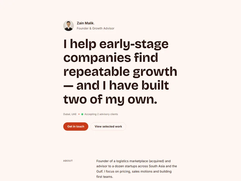
One person, one column, one bright coral accent — a minimal homepage with a clear call to action.
Freelancing & consulting
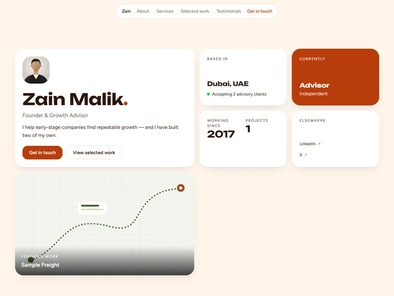
A sunny bento board of availability, toolkit and featured work — perfect for independent makers.
Freelancing & consulting
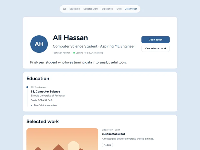
Clean cards with an automatic dark mode — internships, coursework and clubs all look intentional.
Student & early career
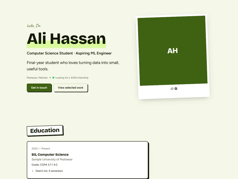
Fresh lime and handwritten notes — a joyful scrapbook for creative students and first jobs.
Student & early career